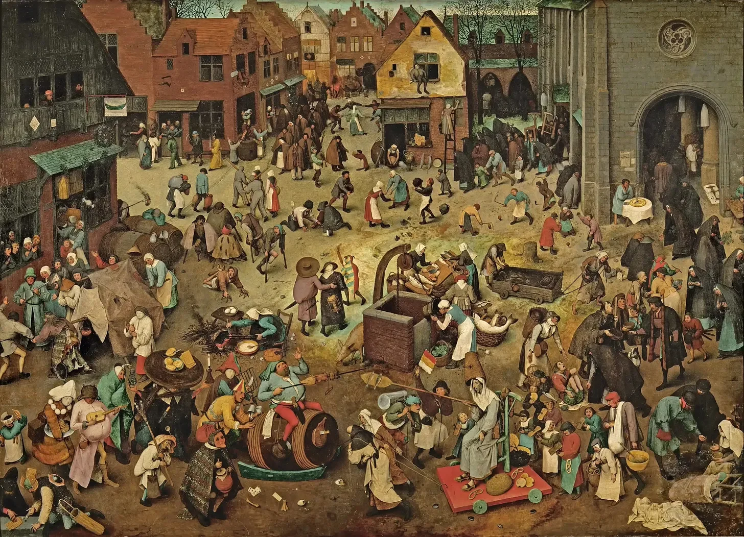
An excerpt from "Wheres Waldo"A Where’s Waldo image is essentially one big populated shape: a rectangle. In Bruegel’s case, a rectangle hung in a frame, displayed on a wall. That rectangle is populated by a thousand little shapes, going about the business of 15th century Flanders, or Hell, or Mount Sinai.

Where’s Waldo:
Why Bruegel is more fun
-
The drama loving folks of the early Baroque, especially the Tenebrists, were hooked on contrast: little fiends for big feeling. These are the days when Opera took off like NWA in the 80s, satisfying the growing craze for the hard drug of spectacle.
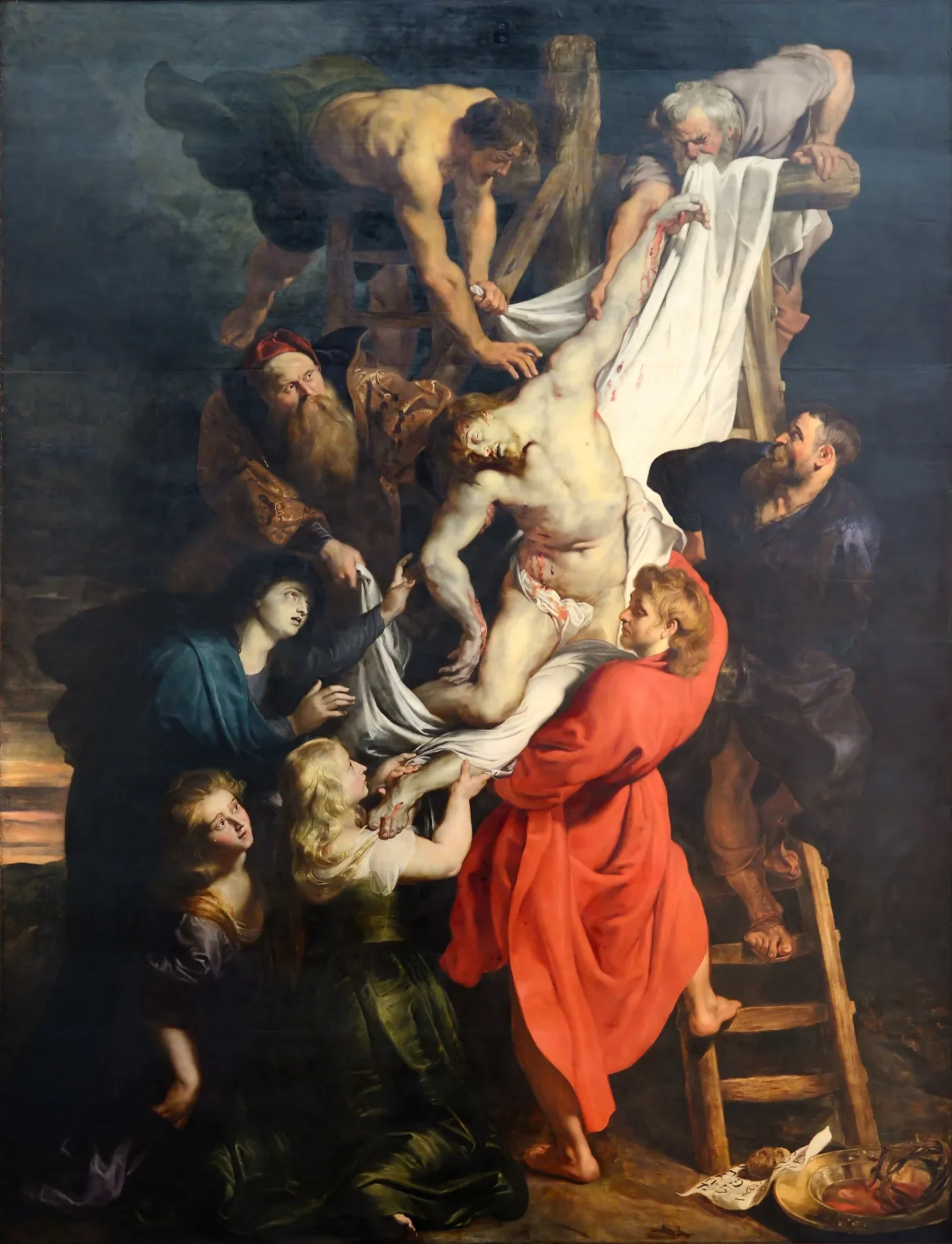
Traditional design principles for artwork made after the Renaissance skew heavily toward the manipulation of light and shadow. Yes, art nerds, I know you know what it’s called and you’re reading this next line for me to validate your knowledge of Italian art-historical terms. Let’s simply say that the effect of light illuminating a room, a stage, a scene is a powerful style and one that painters like Rubens (when he’s good), de La Tour, and Caravaggio all slung like dime bags on a street corner.
We twentieth century art lovers have largely inherited this chiaroscuro fetish (there, I said it). We don’t spend hours in therapy trying to find the root of this preference for drama. We’re not even aware of our collective catharsis cravings. It’s so ingrained in us, both by nature and nurture, that we simply walk around thinking everyone shares our kink. But let’s get on the couch and dig into what conditioning is at work. How did we get here? Because we could be having more fun. My man Bruegel knows what I’m talking about (fist bump across 450 years).
Living in a post-photography world has a lot to do with our inclinations. We have a post-modern preference for visual similarity to cinematic tropes. Our senses are accustomed to being shown highly dramatic narratives in highly dramatic lighting. The spotlight has trained our attention like drug sniffing dogs. But, we also know that scary things lurk in the shadows and the prey portion of our brain gropes around in the dark for meaning and clues, vigilant against the jump scare. Broad, gentle lighting has the taste of ease. So removed are we from the Savannah that a daylit field of grass is a harmless day in a Terrence Malick movie, not a potential ambush by lions.
This taps into possibly an even deeper motive for favoring the high-contrast drama of the stage. At the base of our brainstem, where many of us would place our “alligator brain”, lives is a value-oriented visual processing system; one that we share with most creatures possessing a spine. This system isn’t concerned with nuance or fine distinctions in color. The brain we share with animals is hyper-attuned to motion, contrast and edges. Its calculation in black and white means it works faster, better, and stronger than the newer visual processing center we eventually got around to evolving that can investigate subtle detail and distinguish millions of individual hues. Our black and white brain is what keeps us safe. A tiger to this part of our brain isn’t orange, it is camouflaged perfectly into its surroundings and only motion will give it away. Could this mean that our preference for contrast-y images is rooted in an animal need to identify and distinguish without naming or prolonged attention? Does contrast satisfy our more primal instincts?
Another reason is so obvious my graphic designer readers have been screaming at the page. The graphic quality of strong light effect is catchy from across the room. When you walk into a gallery with a Caravaggio on one wall and a washy pale colored seascape by Turner on the other, you are almost flogged towards the Caravaggio. It’s a hard sell to win attention with Turner’s kind of gray rectangle when there’s a diva in mid aria on the opposite wall. The Japanese understood the hook and termed it notan, a word meaning dark-light. Western art theorists, like Arthur Wesley Dow, made the term pedagogy and developed pictorial theories that were built upon the architecture of good light and dark shape harmonies. If the picture doesn’t work in its simplest graphic form, no amount of shading or color can save the composition. A solid principle for a beginning artist to be sure, but at the cost of satisfying the newer, more detail-oriented part of our brains.
So what do we do with Bruegel and the like? When we look at pre-Baroque work there is largely an absence of strong light effect. Not to say that contrast didn’t exist, but an underlying preference for large areas of light and shadow seems to be deliberately eschewed in favor of maximal content. When you stand back from a Bruegel it is a busy rectangle, almost like a beefed up Pollock. There’s a lot to see but you can’t see anything from across the room. So, the busyness itself becomes the draw. The bits and bobs beckon you to come closer. Once you’re there, you engage the Where’s Waldo part of your brain. The childlike activity of scanning for recognizable people and things is decidedly enjoyable. In many cases the average time spent in a museum with a Bruegel will outlast the Caravaggio because there’s simply more to discover. This act of Where’s Waldo-ing an image is the reward for investigation.
Why don't Caravaggio or other notan-principled artists reward us in the same way? They can, and in some very successful cases they do. A composition can possess both the busyness of the Bruegel married to the large light effect of chiaroscuro. If and when they do it’s more fun. It’s just about populating the shapes.
A Where’s Waldo image is essentially one big populated shape: a rectangle. In Bruegel’s case, a rectangle hung in a frame, displayed on a wall. That rectangle is populated by a thousand little shapes, going about the business of 15th century Flanders, or Hell, or Mount Sinai. What if an artist partitioned the rectangle into two big shapes? A lighted area, and a shadowy world. The artist must exercise discipline, restraint…economy. In art-speak we call it compression. The light world has a range of lights and darks that are its currency. The shadow world has its own coin. If the artist tries to spend too much light world currency in the dark world the picture will fall apart. The effet (literally the French artistic word for tonal balance) ruptures. The spell lifts and we’re back at a chaotic rectangle in a frame on a wall. The segmenting of these two worlds, the economy with the currency valid in each, is fundamental to maintaining the large image: the hook that pulls you across the room.
My theory, my strong opinion, is that Where’s Waldo is more fun than the theater of stage lighting. The kid in us likes to investigate, to look under rocks and climb up in trees. Detail titillates the little magpie that lives in each of our brains. Each time we see a familiar Bruegel we see new things. The joy of discovery is limitless. I’m by no means opposed to chiaroscuro. But, if we’re going to be junkies for big light effect, let’s have some fun. There is seduction to contrast, yes, but there is delight in discovery. The next time you’re in the presence of a painting you can identify as possessing good light/dark shape design, get closer. Did the artist reward your curiosity? Were you paid in detail for your investigation? Did you get to Where’s Waldo any part of the worlds they created? If not, you can now put a name to your disappointment. Go find a decorated rectangle and look around. Bonus points if you find a man in a red and white striped shirt.